The World Map Is Not the World
The World Map Is Not the World: choose a projection that fits your task, from comparing land area to planning a route or teaching global geography.
The World Map Is Not the World: a flat map can make Greenland look close in size to Africa, even though the two landmasses differ enormously in area. That is not a printing error. It is a consequence of turning Earth’s curved surface into a page, a process that forces every mapmaker to make choices.
Those choices affect shape, area, distance, and direction. No single world projection preserves all four everywhere. The useful question is not which map is perfectly accurate, but which distortion matters least for the job in front of you.
Choose a projection by the question you need to answer
Start with the task, not the look of the map. A projection that helps compare countries may be a poor choice for planning a long flight. A map that keeps familiar shapes can mislead when readers compare the size of regions.
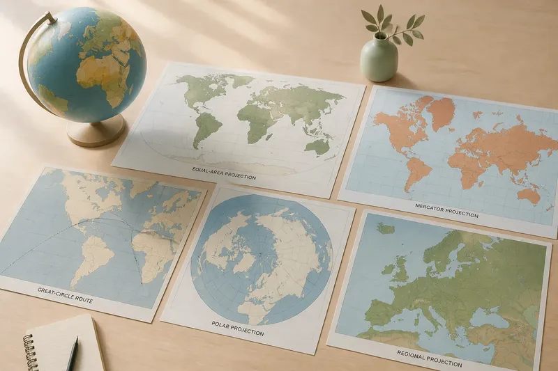
- Comparing land area: Choose an equal-area projection. It preserves relative area, so regions do not gain or lose apparent size as they move across the map. Shapes may look stretched or compressed, especially near the edges.
- Showing familiar shapes: Choose a conformal projection, such as Mercator, when local angles and shapes are important. It preserves angles at small scales, but area grows dramatically toward the poles. Do not use its appearance to judge which country or continent is larger.
- Plotting a long route: Use a globe or a map designed for navigation. A straight line on a flat map often is not the shortest path over Earth’s surface. On a Mercator map, a constant compass heading appears as a straight line, while the shortest route is generally a curve.
- Showing a continent or region: Pick a projection centered on that region and suited to its orientation. A map focused on the equator has different needs from one focused on a polar area.
- Giving a broad overview: A compromise projection can balance distortions without preserving one property exactly. It may make a readable classroom or reference map, but it is not a measurement surface.
If the map’s purpose is unclear, look for its projection name and scale before making comparisons.
Area, shape, distance, and direction cannot all stay true
Imagine drawing a pattern of squares on an orange peel, then trying to press the peel flat without tearing, stretching, or overlapping it. Some parts must change. Earth’s curved surface presents the same problem, though projections use mathematical transformations rather than flattened fruit.
An equal-area projection preserves how much surface each region represents. It is well suited to comparing the relative size of countries, forests, or climate zones. Its tradeoff is visible in shape: places may look wider, narrower, or more distorted than readers expect.
A conformal projection preserves local angles, which helps maintain the shape of small features and supports certain navigation uses. It cannot also preserve area across the whole map. Mercator’s increasing enlargement toward the poles makes high-latitude regions appear far larger than their actual share of Earth’s surface.
Distance is not preserved everywhere by a typical world projection. A scale bar applies only where the map’s scale is intended to be accurate; distances can vary by location and direction. Direction has similar limits. A line that points in a particular direction on the page may not represent the same direction from every point on Earth.
Every map makes a case for what to notice. Read its projection as part of that case.
World map projection choices depend on your situation
Which projection works best for comparing country sizes?
An equal-area projection is the appropriate starting point because it preserves relative area. Check that the map identifies itself as equal-area, and remember that its outlines may look less familiar than those on a conformal map.
Why does Greenland look so large on some maps?
On a Mercator map, areas far from the equator are enlarged to preserve local angles and shapes. Greenland’s appearance is therefore not a reliable guide to its actual area relative to Africa or other regions.
Is a straight line on a world map the shortest route?
Not necessarily: the shortest path over a globe usually appears as a curved line on a flat map. The answer depends on the projection and the line being drawn, so use a globe or a suitable route map when travel distance matters.
Can one projection show everything accurately?
No flat projection can preserve all properties everywhere on Earth. A projection can prioritize area, shape, or another feature, while a compromise projection spreads distortion among several properties.
Read the map’s center and edges before trusting its visual balance
A projection also decides how Earth is arranged on the page. The mapmaker chooses a central meridian, the line of longitude placed near the middle, and may split the map along another line. That seam can cut through the Pacific, the Atlantic, or another ocean. The land at the far edges may look stretched, and a place divided by the seam can seem farther from its neighbors than it is on a globe.
Polar regions need special attention. A world map centered on the equator often gives high latitudes a distorted appearance or leaves them difficult to read. A polar projection can make relationships around the Arctic or Antarctic easier to examine, but it presents the opposite side of Earth less usefully. For a regional question, a projection centered on the region is often clearer than a single map meant to show everything.
Say you are preparing a classroom discussion about which continents occupy the greatest area. If the wall map uses Mercator, students may infer that northern landmasses are larger than they are. Switching to an equal-area map gives a fairer visual basis for comparison, while a note about altered shapes explains why the continents now look unfamiliar.
Use the map that fits, then name its limits
A map is a model, not a neutral window. Its projection, center, scale, and edges shape what readers can see and what comparisons seem natural. Those choices do not make the map useless; they tell you how to use it responsibly.
For a quick check, ask what property the map preserves, where its scale is most reliable, and whether the places you are comparing sit near its center or edge. If those details are missing, avoid treating apparent size, straightness, or distance as decisive evidence.
The World Map Is Not the World, and that distinction is practical: keep an equal-area map handy for size comparisons, use a globe for broad route intuition, and choose a regional map when local relationships matter. The best map is the one whose distortions do not undermine the question you need to answer.